Review: Creative Characters
Dutch BIS has published a collection of Jan Middendorp’s interviews with leading typeface designers from throughout the world originally published electronically by MyFonts.com between 2007 and 2009.
Even though the newsletters are sent to nearly 750,000 email addresses, it is the book format that brings the weight the interviews deserve – if only for the fact that computer monitors do not yet allow one to truly inspect the details of a text face.
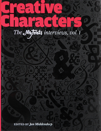
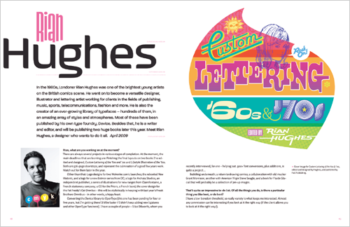
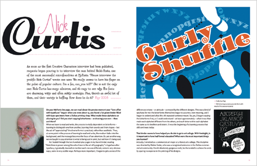
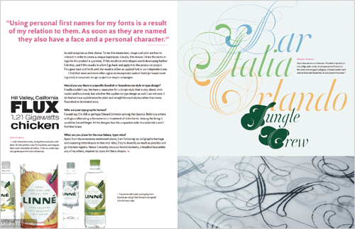
A brief foreword by Jan Middendorp is followed by 180 pages filled with 26 richly-illustrated interviews featuring typeface samples as well as reproductions of sources of inspiration and examples of completed works. Questions mainly revolve around the subject of typeface design, but sometimes meander into more personal matters. As a result, the book offers a remarkable window into the souls of the typographers. The reader can see how their common passion for letters is expressed and how the designers differ in their specific approaches to font design. In Volume I – indicating that there will be further volumes – David Berlow, Jean François Porchez, Veronika Burian & José Scaglione, Jos Buivenga, Alejandro Paul, Mark Simonson, Dino dos Santos, Christian Schwartz, František Štorm, Tomáš Brousil and the fellows from Underware all speak about their fonts.
After the book was delivered and I unwrapped it, I was surprised by how large it was; subconsciously and based on the images posted online, I had expected the book would be smaller. The book format does offer plenty of space for illustrations, but in any case don’t think that this is a book you would be able to read during your morning commute. At first I was taken with the elegant cover decorated with scores of different variations on the ampersand printed in partial gloss on a black background. But I literally reacted with a start as soon as I opened the book. Heavy and full, the pages seem like promotional fliers. It seemed as though every graphic design element was oversized, and the Auto text face at that font size did not encourage me to read at all. I can’t help but feel that the artistic design that was used, which stands in direct opposition to Jan Middendorp’s highly readable text, harms this otherwise excellent book.
Jan Middendorp: Creative Characters. Design: Nick Sherman. Dimensions: 21.5 × 28 cm, 192 full-colour pages, printed flexible covers, ISBN: 978−90−6369−224−7.
Add Comment
Author’s latest articles
- TyPoll – Typo Survey 19. 12. 2012
- Trnava Poster Triennial 2012 10. 4. 2012
- Type Specimen for iPad 24. 2. 2011
- European Design Awards 2011 – call for entries 11. 1. 2011
- Austrian Design in Prague 21. 11. 2010


 Filip Blažek

Comments (1)
bought this book! can’t wait to get it!
26. 10. 2011, 19:48